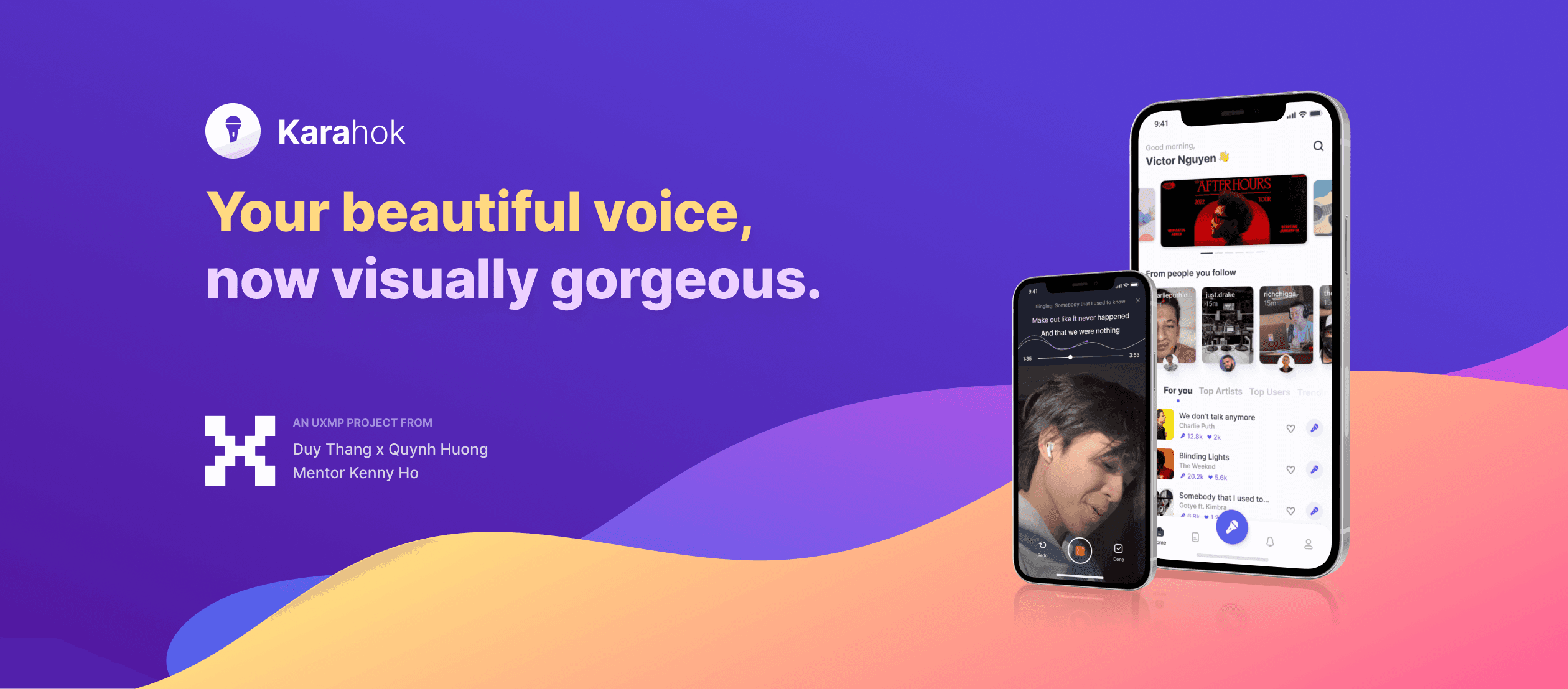
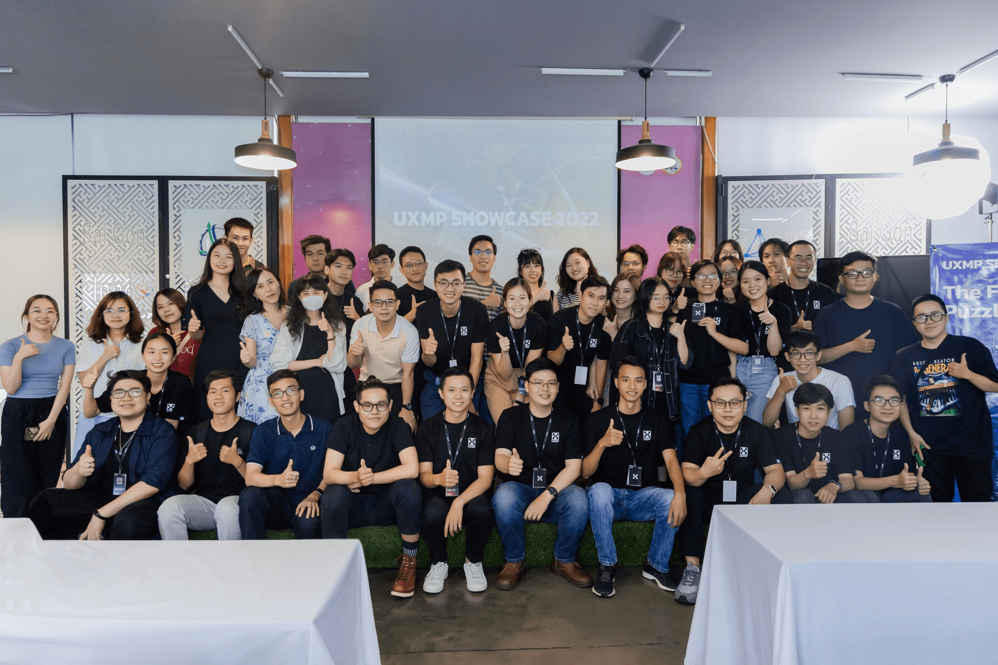
Mentor
Kenny Ho
Teammate
Duy Thang
TIMELINE
Description
UX Mentoring Program Vietnam (UXMP Vietnam) is the first mentorship program to support young Vietnamese UX newbies in developing their UX career directions and skills throughout a series of personalized and high-impact mentoring activities.
OVERVIEW
This case study is about the journey (more like a story) of two beginners and the lessons we learned while building our first app from scratch. (Spoiler: 7kg was the total amount of weight we had lost)
That Day We Learned
My 3-month journey can be summarized into 4 boxes as follows:
In this article, I will take you back to the journey I went through to understand why I had those four lessons.
Prologue
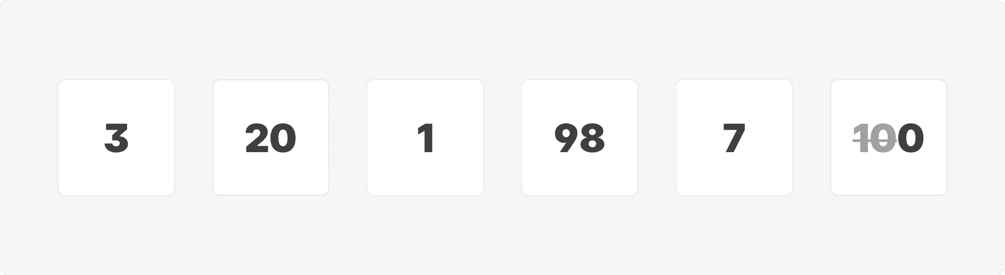
The Significant Numbers
3 months was the total time of the program
20 was the initial number of ideas that my teammate and I wanted to do
1 idea was selected
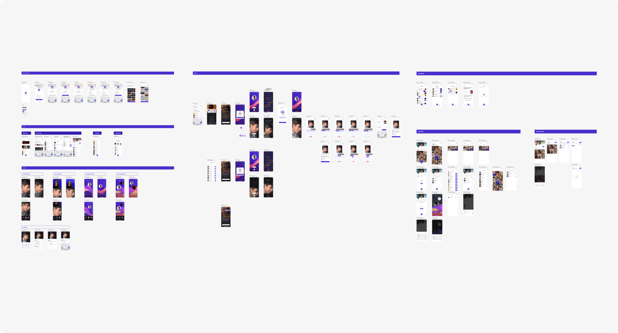
98 screens were designed
7 kg was the total amount of weight we had lost
100 was the number of times we argued
The Beginning
Everyone starts with an idea and ends with a show case.
With all our youthful enthusiasm, we started with a list of 20 ideas.
After receiving advice from our mentor, our squad decided to choose the project: "Designing a Karaoke app" for two reasons:
Karaoke is a familiar entertainment activity (and we both like singing)
Our track was UI design, so a karaoke app will give us more freedom in terms of designing interface than a banking or hotel booking app
And our goal is to make a complete app from scratch (It could be possible if we skipped sleeping, eating, our full-time job and daily activities - yes, it's impossible and that's why there were only 98 screens designed) and focus on UI skills such as: How to set up UI Kit, how to choose colors, fonts...
Chapter 1 ended with one idea chosen and two people unaware of the difficulties they were about to face.
It's a big big world
If you're experienced, you might already know what our first problem was.
"Designing a Karaoke app" was too broad of a statement. We didn't know about the next steps. We needed to narrow it down.
And that was when our squad unintentionally entered new area, far from our original focus, called Product and UX Research.
There was no plot twist. We got lost.
We have tried many research methods such as competitor analysis, user persona,... But the information we gathered lacked practical value. Why? Because we didn't know the purpose behind each method. We did it just because other case studies did it, too. For example, all the apps we analyzed in competitor analysis were for the international market, targeting young users. However, our user persona turned out to be a 50 years old, married, Vietnamese woman.
We were utterly lost.

Come to The Rescue
Long story short, here's the evolution of final direction:
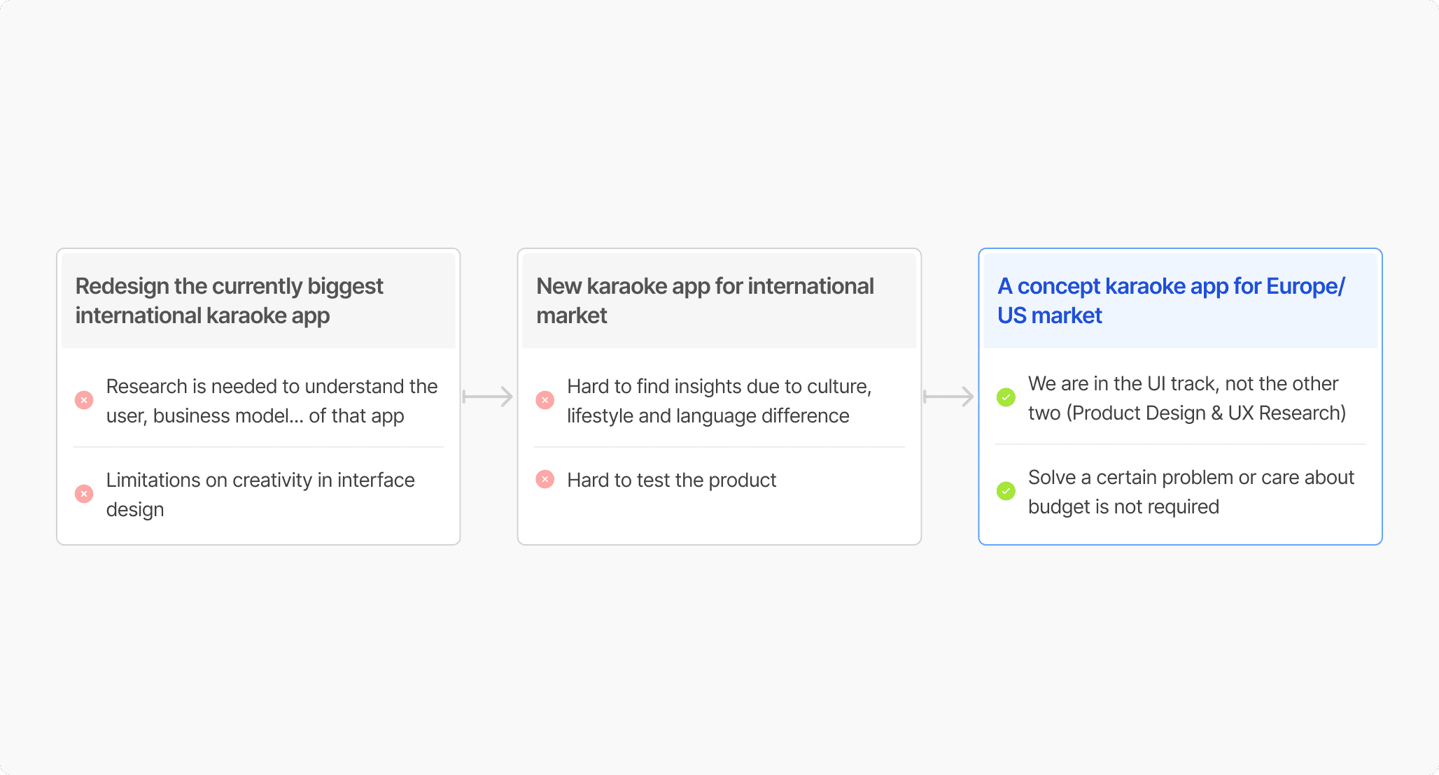
We struggled for 2 to 3 weeks until our mentor reminded us that the team was on the UI track — we should focus on UI design skills instead, and should take advantage of not having to solve a certain problem for the project.
Finally, we decided to build a concept app to explore the strengths and weaknesses of existing Karaoke apps while introducing a unique feature that no app on the market has: Creating layers, allowing users to generate backing vocals and even an acapella version.
…But not that easy
After having a way out, we started creating Sitemap, User Flow and Wireframe.

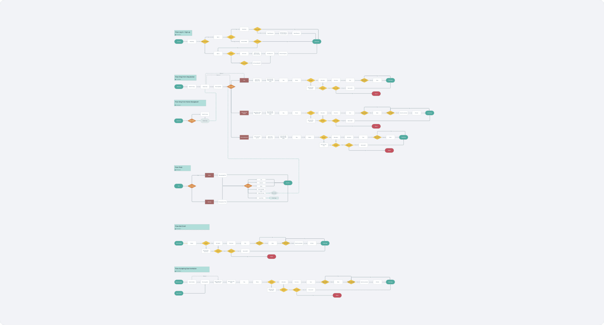
To have three images above, we encountered many difficulties. This was the first time we carried out a big project ourselves, we were so confused and always wondered if we were doing things right.
We felt like two city kids being thrown into the woods for the first time without a compass or any survival skills. We didn't know how to manage our time and energy, which had led to feelings of lost and exhaustion midway through the journey.
At this point, I'd like to thank the organizers for the mid-program retrospective session. It was a spirit-boost for our team and the rest. <3
And we didn't give up. (We made it to the showcase!)
Looking back, we learned that: We must agree on a direction, have a schedule for group discussion as well as maintain clear communication to ensure everyone is updated on their progress.
And don't give up. The result might be bad, but failing to meets commitments is even worse.
Before Figma
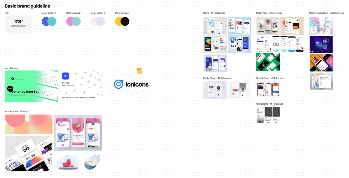
This was when we created a mood board, chose typeface, icon style, and colors for the app.
For the colors, we choose blue and purple pink to make the app look lively and relaxing.
For fonts, we selected the Inter typeface - suitable for our clean & modern direction. This typeface offers a wide range of weights and styles, making it easy to apply and read.

We now had the foundation. But instead of immediately diving into UI design, we designed a few test screens to help determine the final direction. And with the help of our mentor, we agreed on a direction and began designing the UI and building the UI Library on the go.
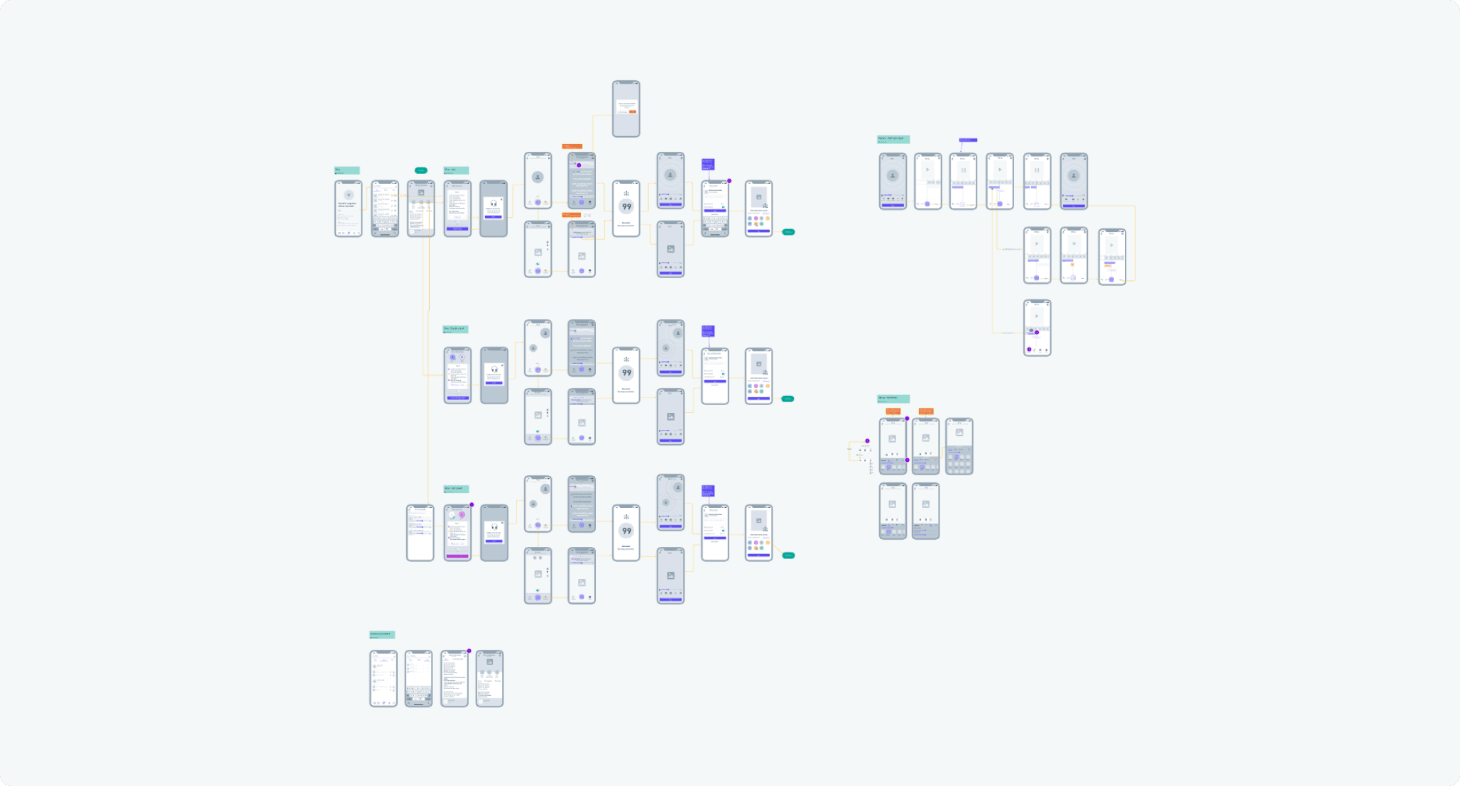
And the final design is below.
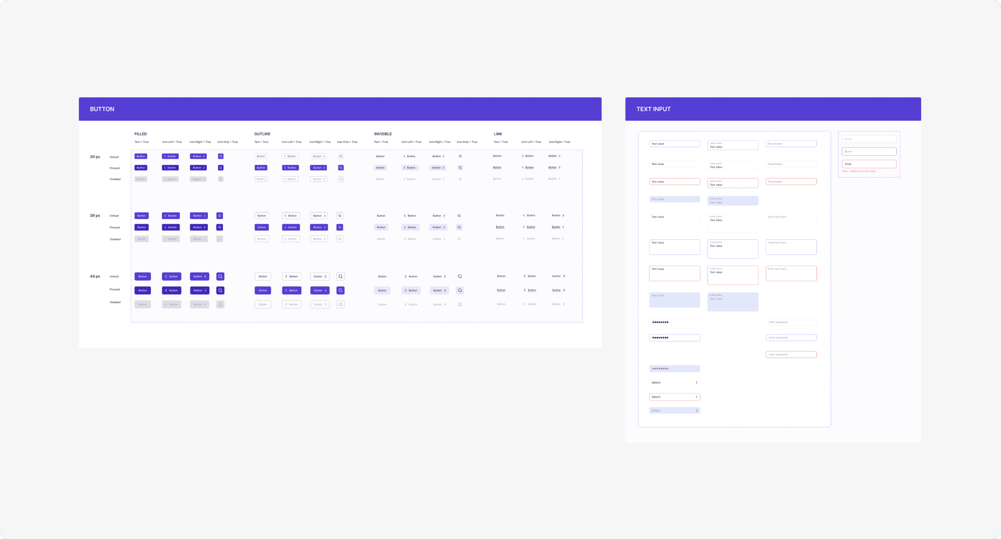
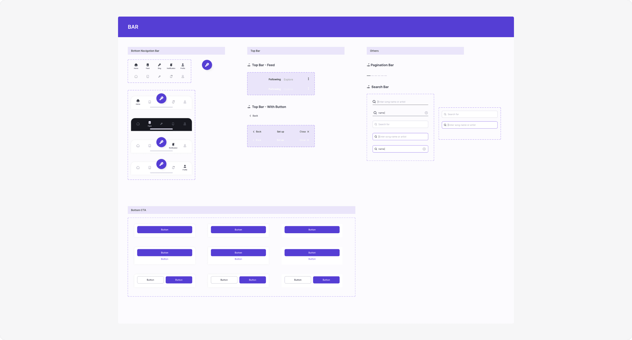
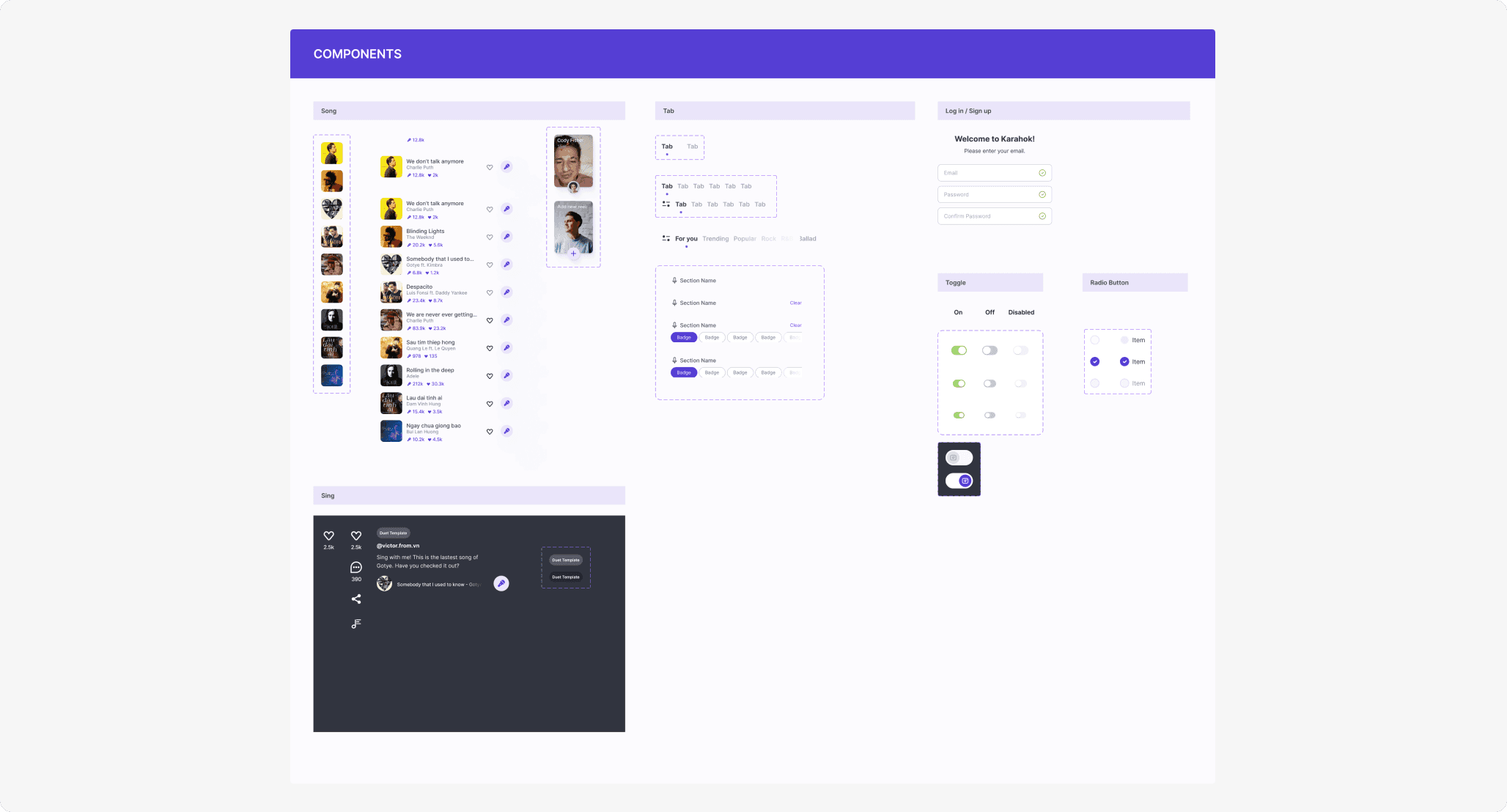
The UI Library

· Typography, Color, Swatches, Grid


· Button & Text Input


· Components
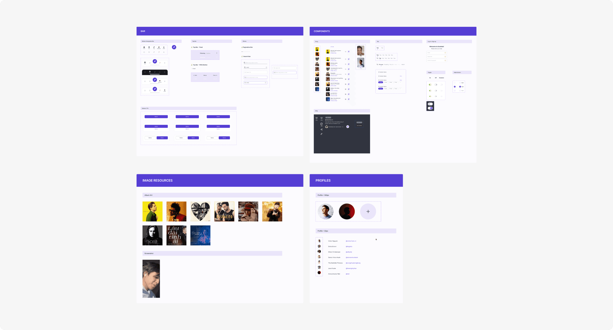
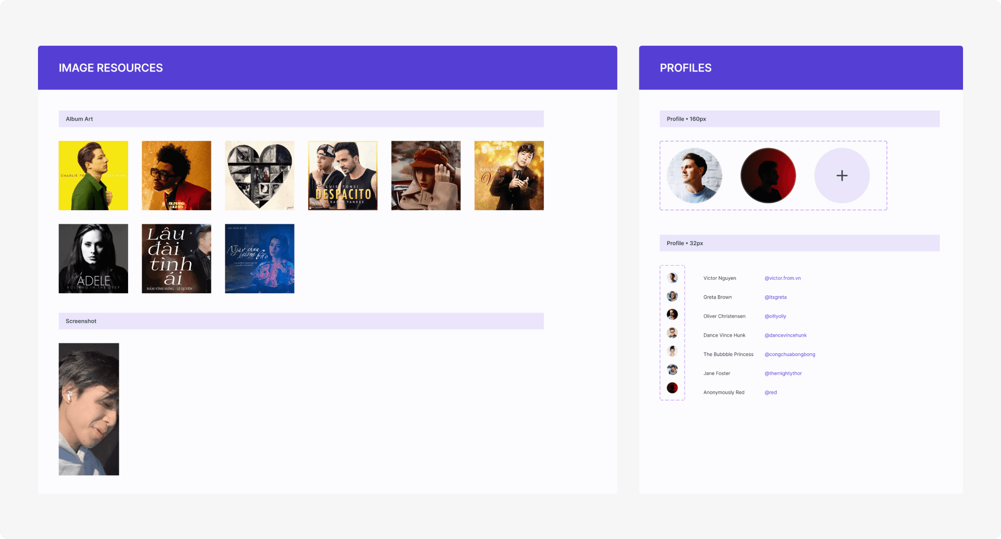
Screens

Wrap-up
Although we were not satisfied with the outcome because we both know we could do better, but that final design was the best version we could deliver at that time. Lessons learned, and if we could do it again, we would have a totally different approach.
(Especially the research phase.)
Thank you
Other works: